
Brand identity for a UK maternal health and midwifery expert
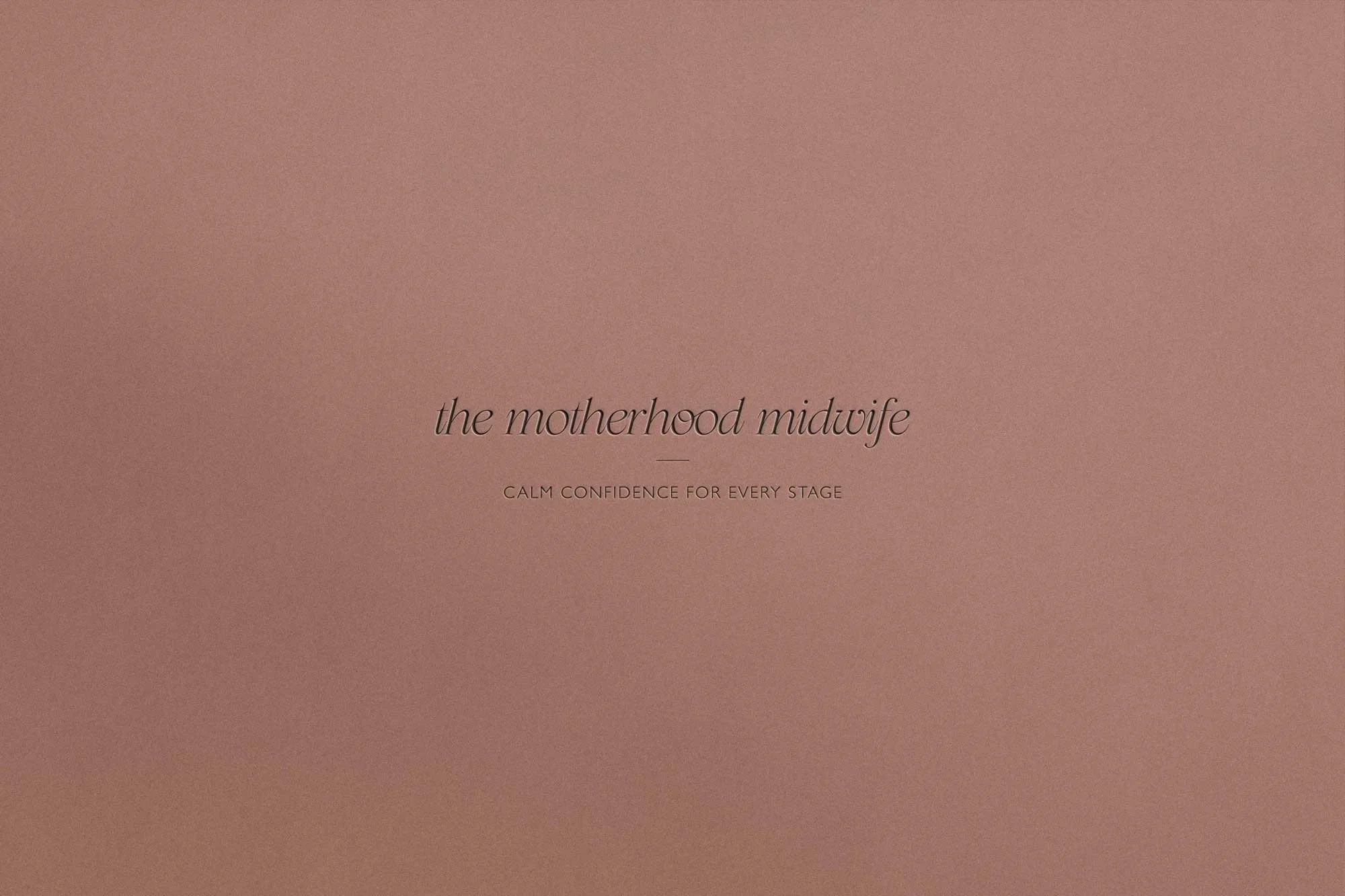
BRAND identity DESIGN for The Motherhood Midwife
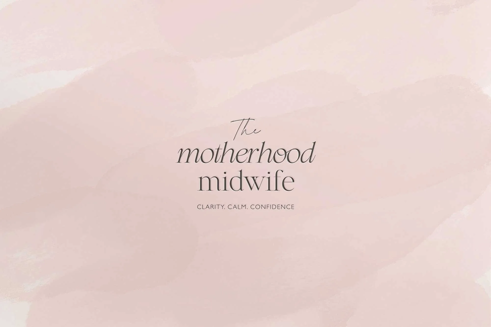
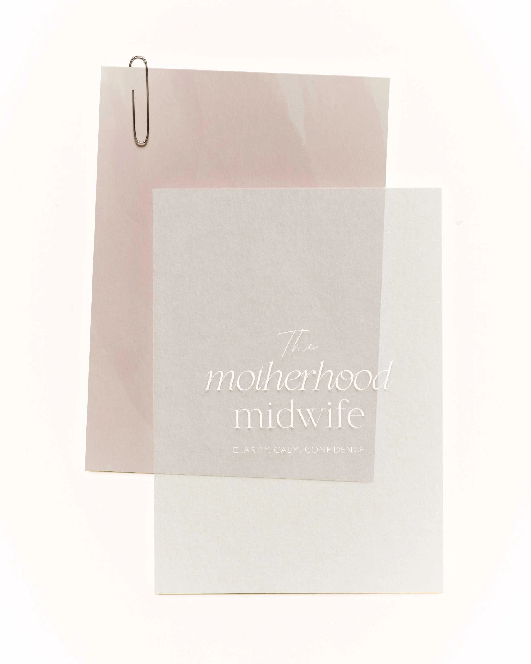
The Motherhood Midwife is a UK maternal support brand founded by midwife Clare O'Brien, offering calm, evidence-led guidance for parents navigating pregnancy, birth and early motherhood. Clare was trading as The Calm Baby Coach - a name that no longer reflected the depth of her expertise.
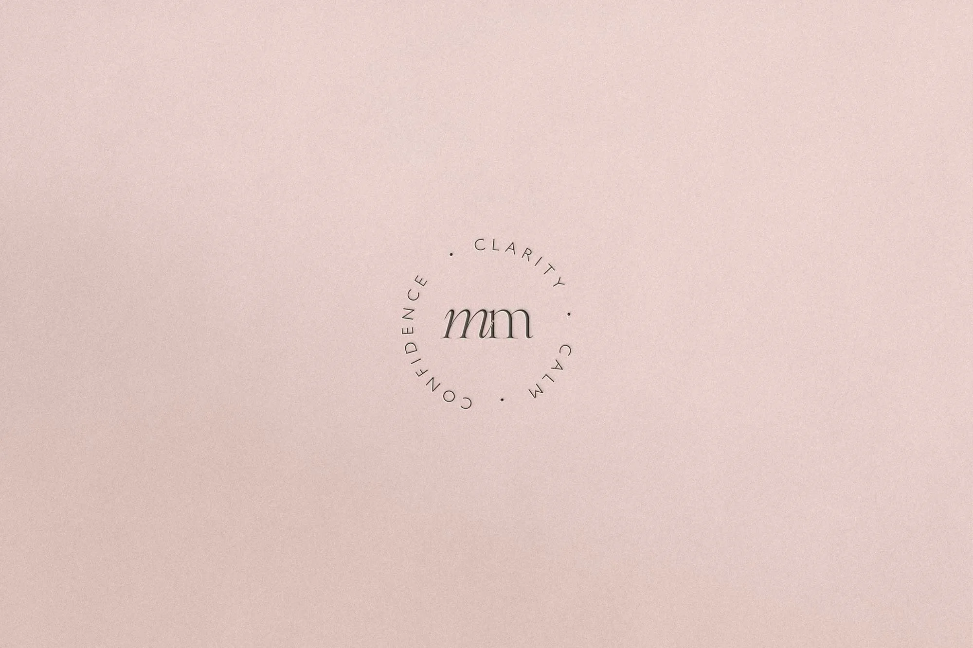
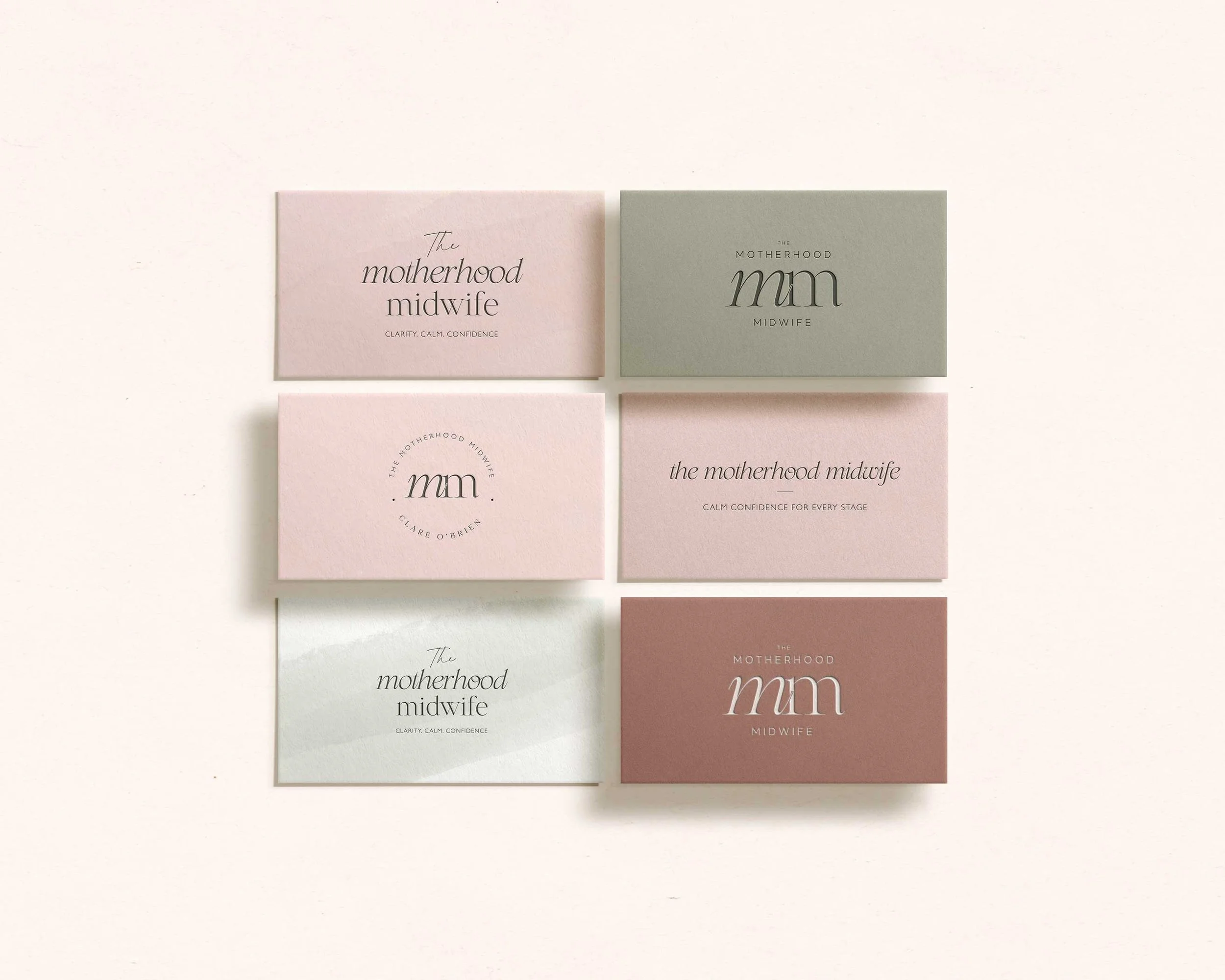
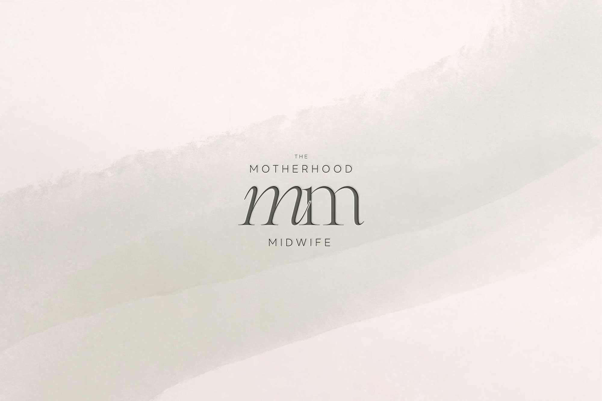
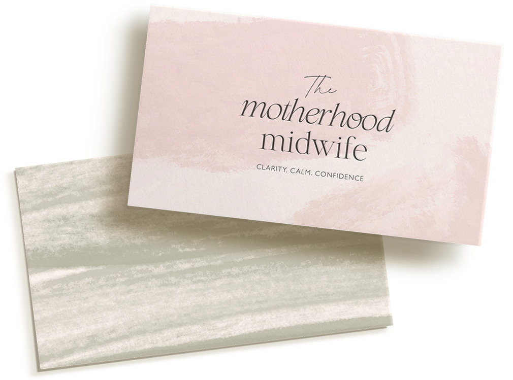
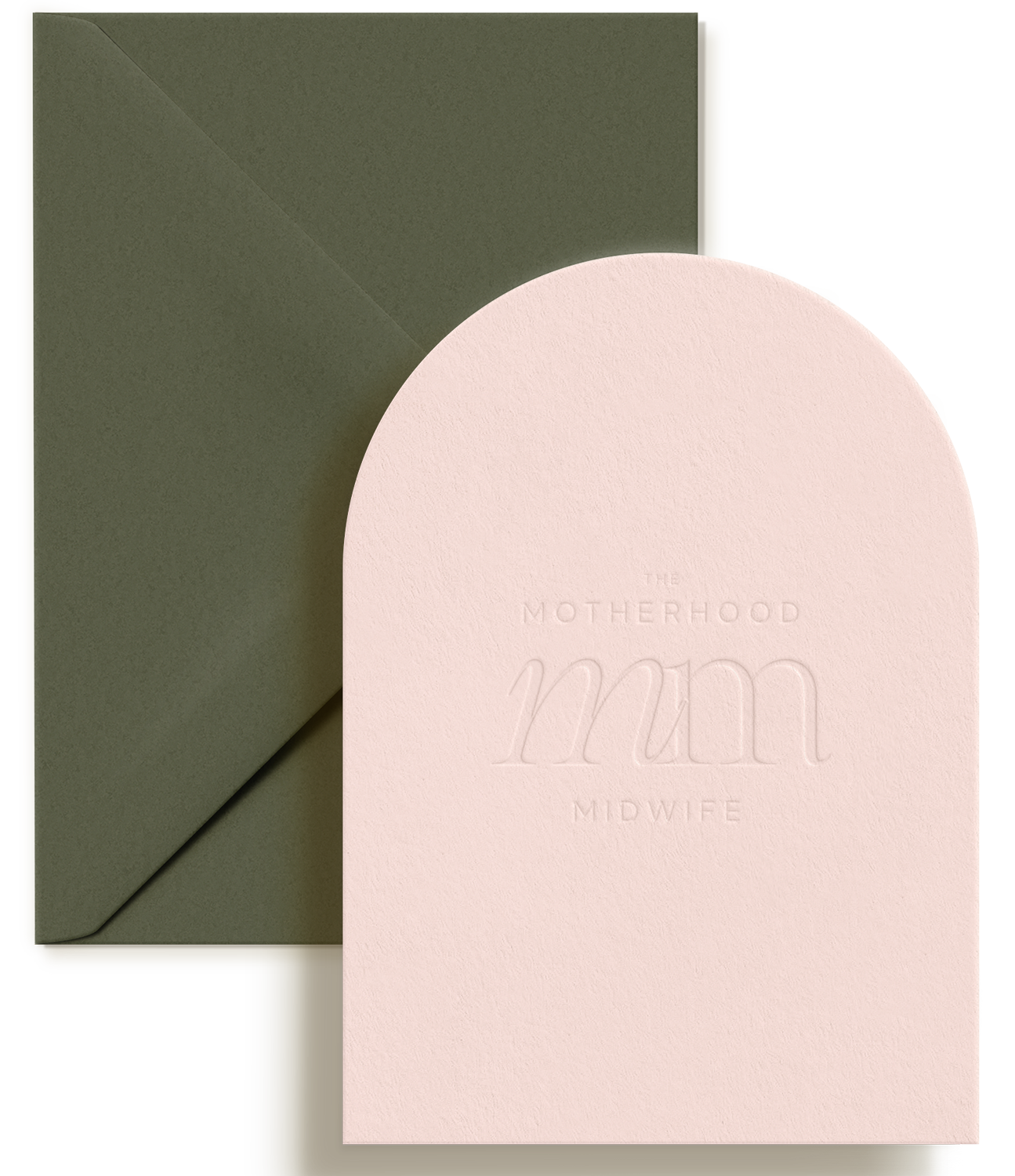
The rebrand repositioned her toward something more professionally credible, with the name change central to the strategy. A rounded serif wordmark, dusty pink, sage and warm neutrals and soft painterly textures create calm authority: reassuring without being soft, professional without being cold.
Services used: Custom Branding Design
The transformation
The outcome
"A confident foundation to show up consistently and proudly."
Clare now has a brand that reflects both the emotional and professional depth of her work, and the confidence to match.

In her words
“Tamsin gave me a brand that reflects both the emotional and professional depth of my work.”
“My brand didn't reflect who I was as a midwife or what I offered. Working with Tamsin was exciting, creative and beautiful from start to finish, and everyone who has seen the new brand has loved it.”
- Clare O'Brien, The Motherhood Midwife
Could this be you?
If your brand is holding back a business that's ready to grow, let's change that.
I'd love to hear about what you're building.