
Luxury Craft Brand Identity Design
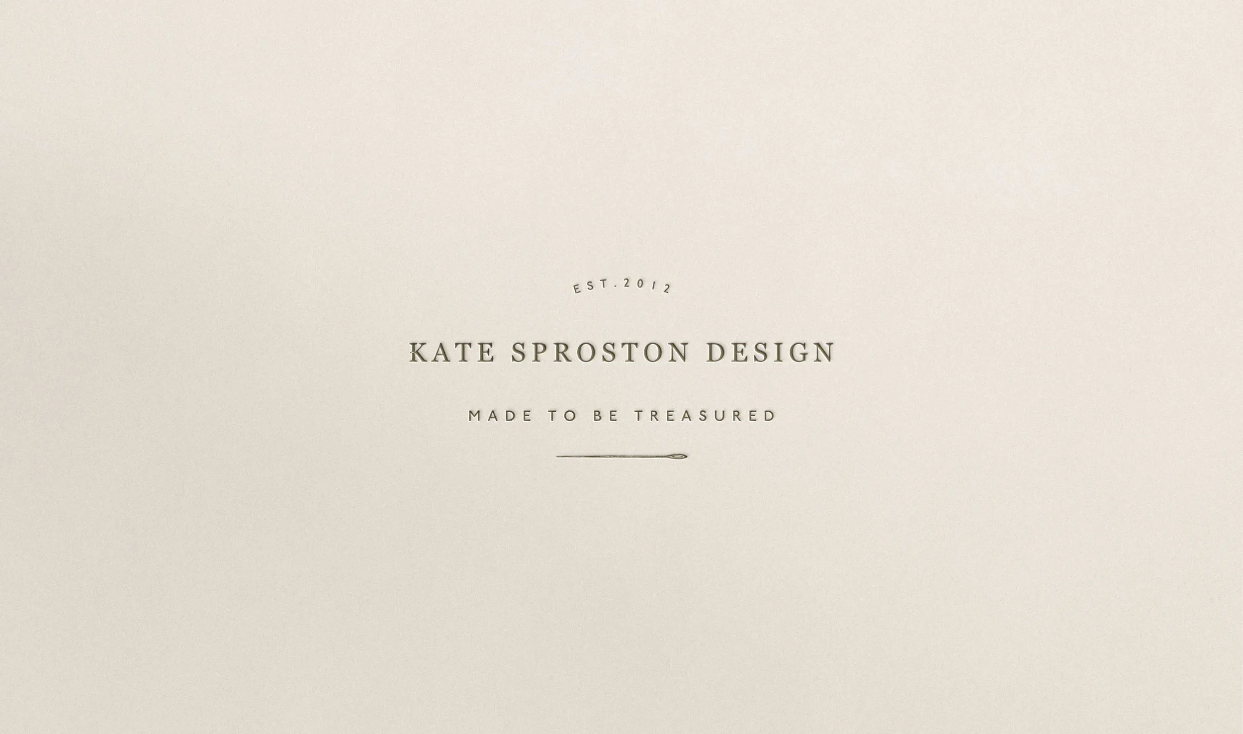
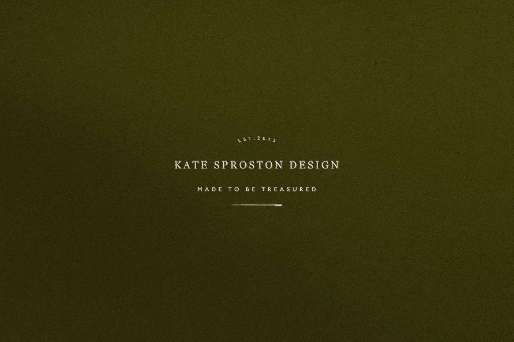
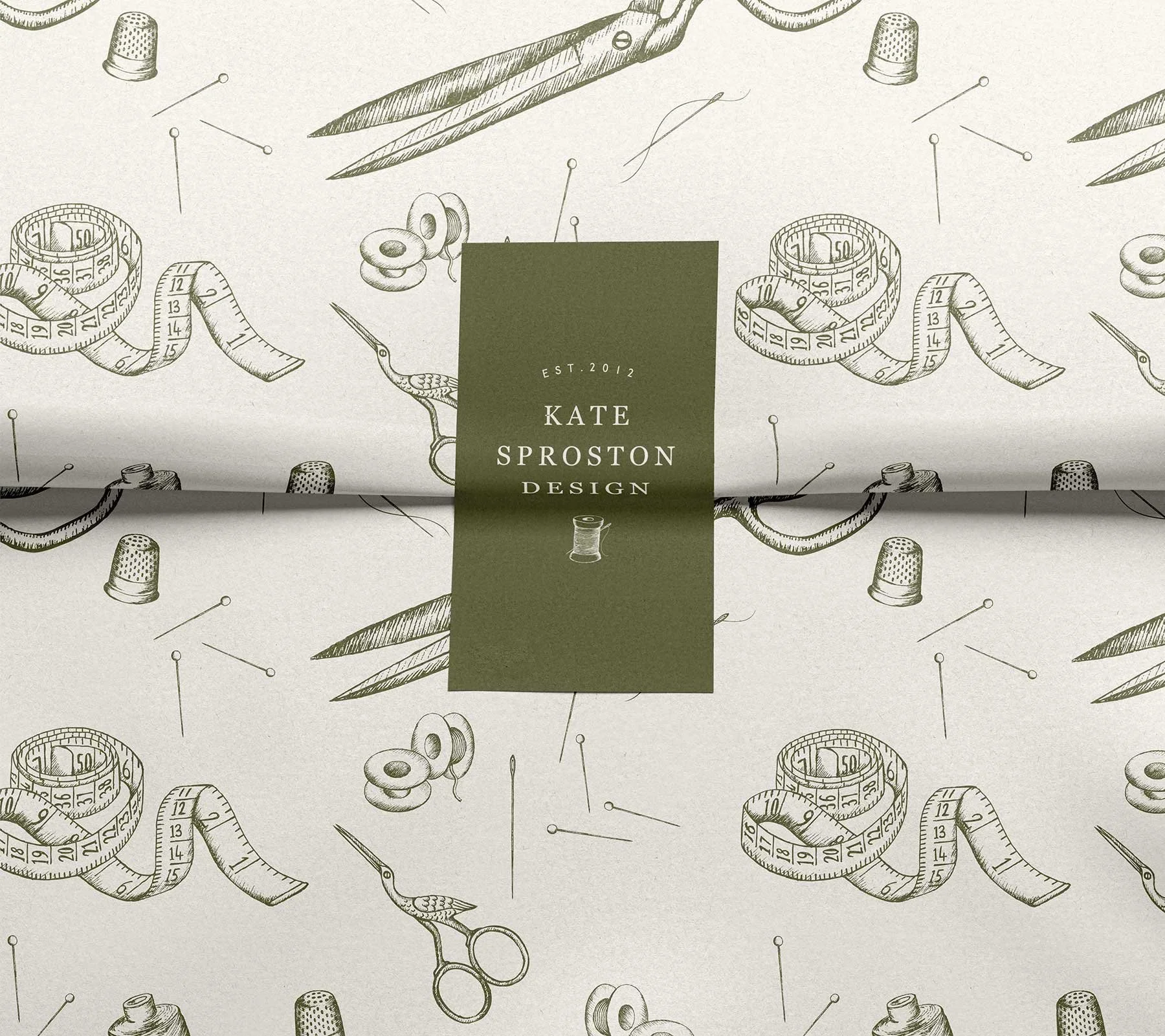
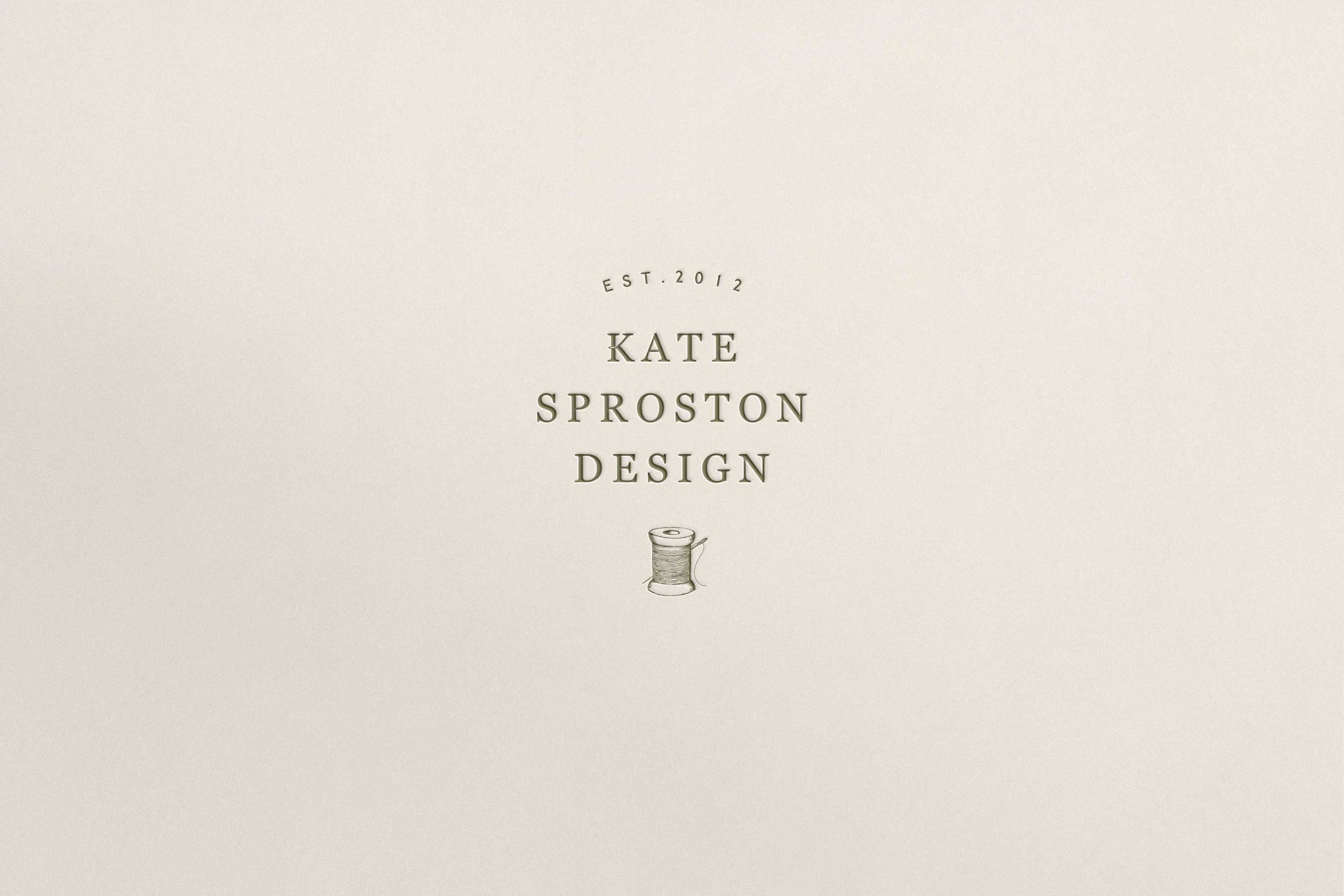
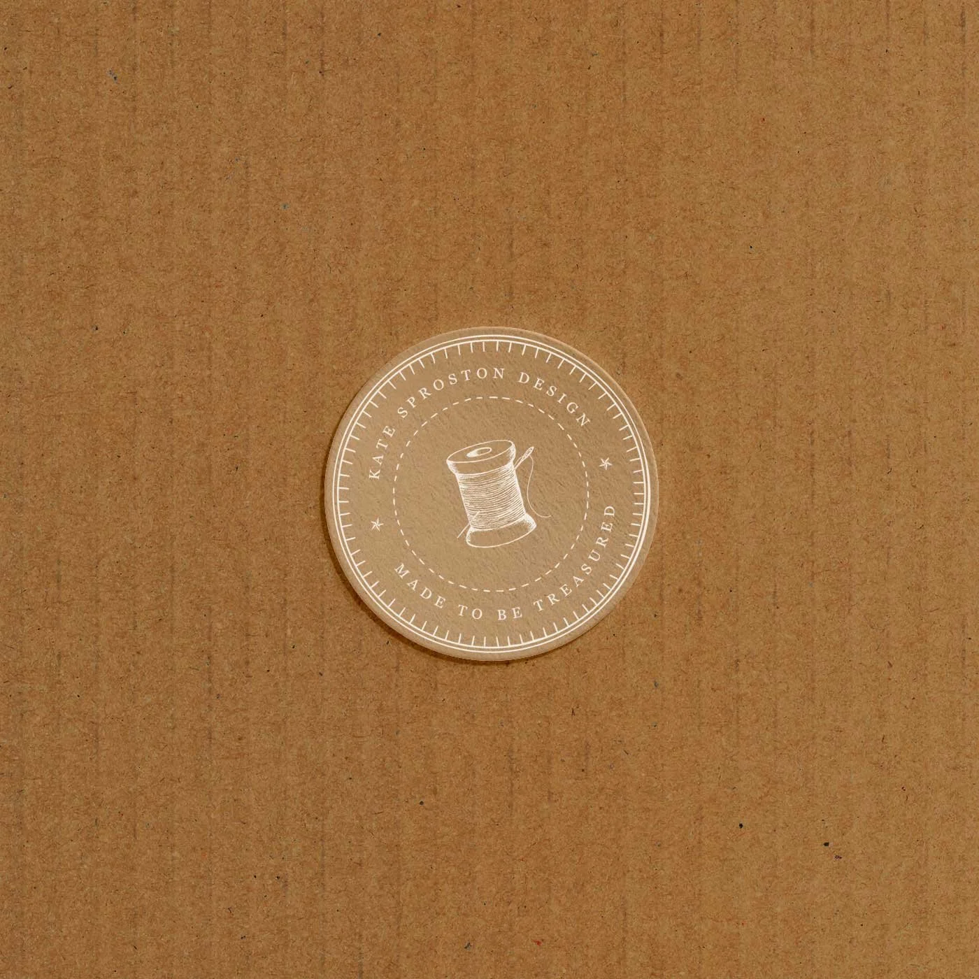
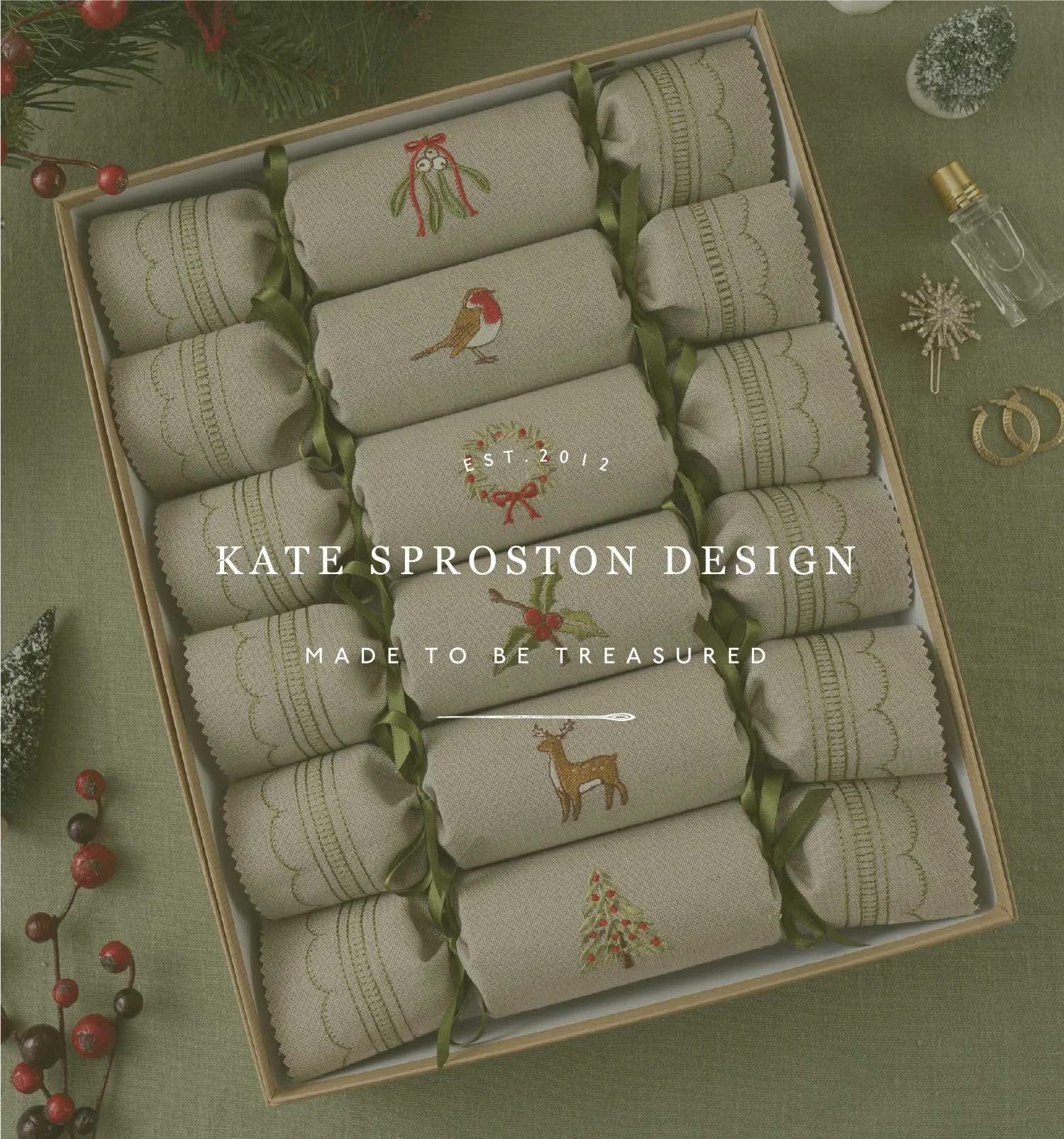
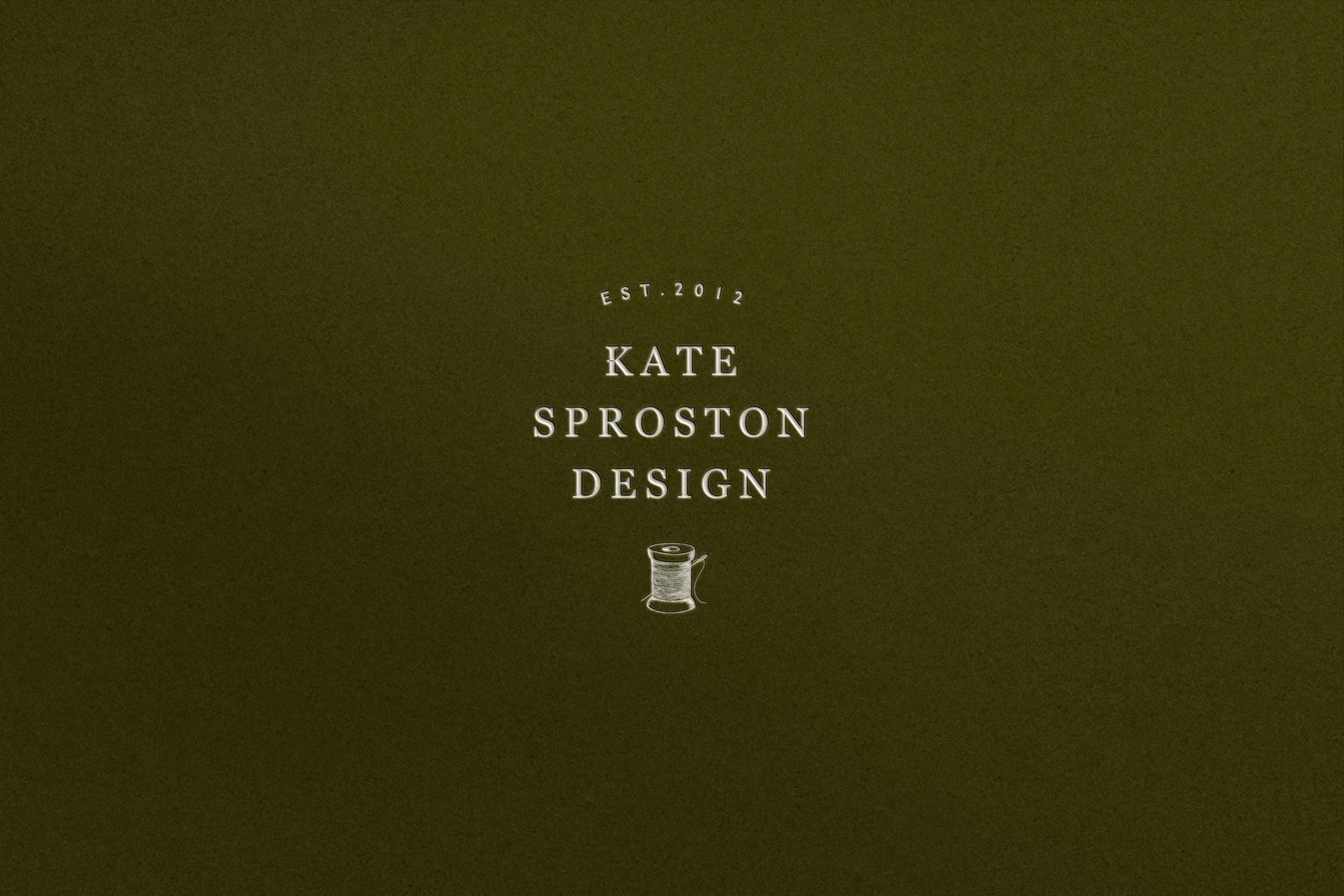
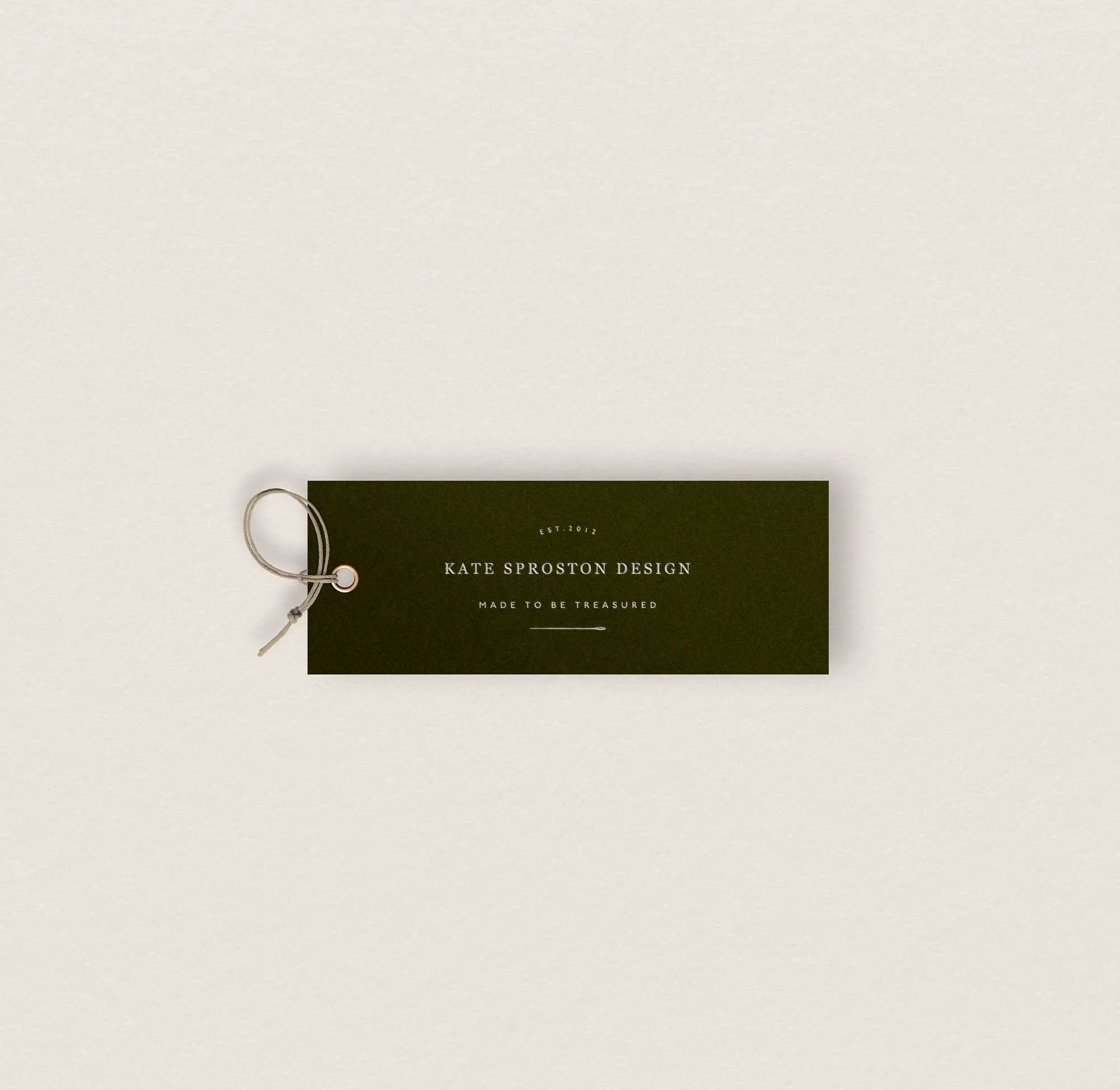
Kate Sproston Design - modern heritage embroidery brand identity
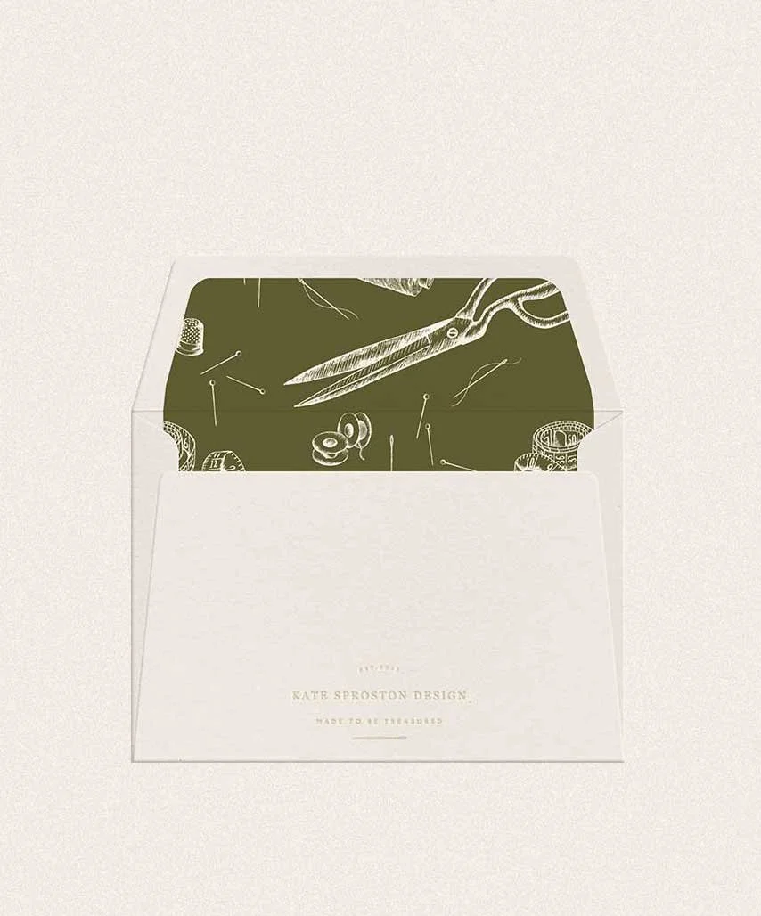
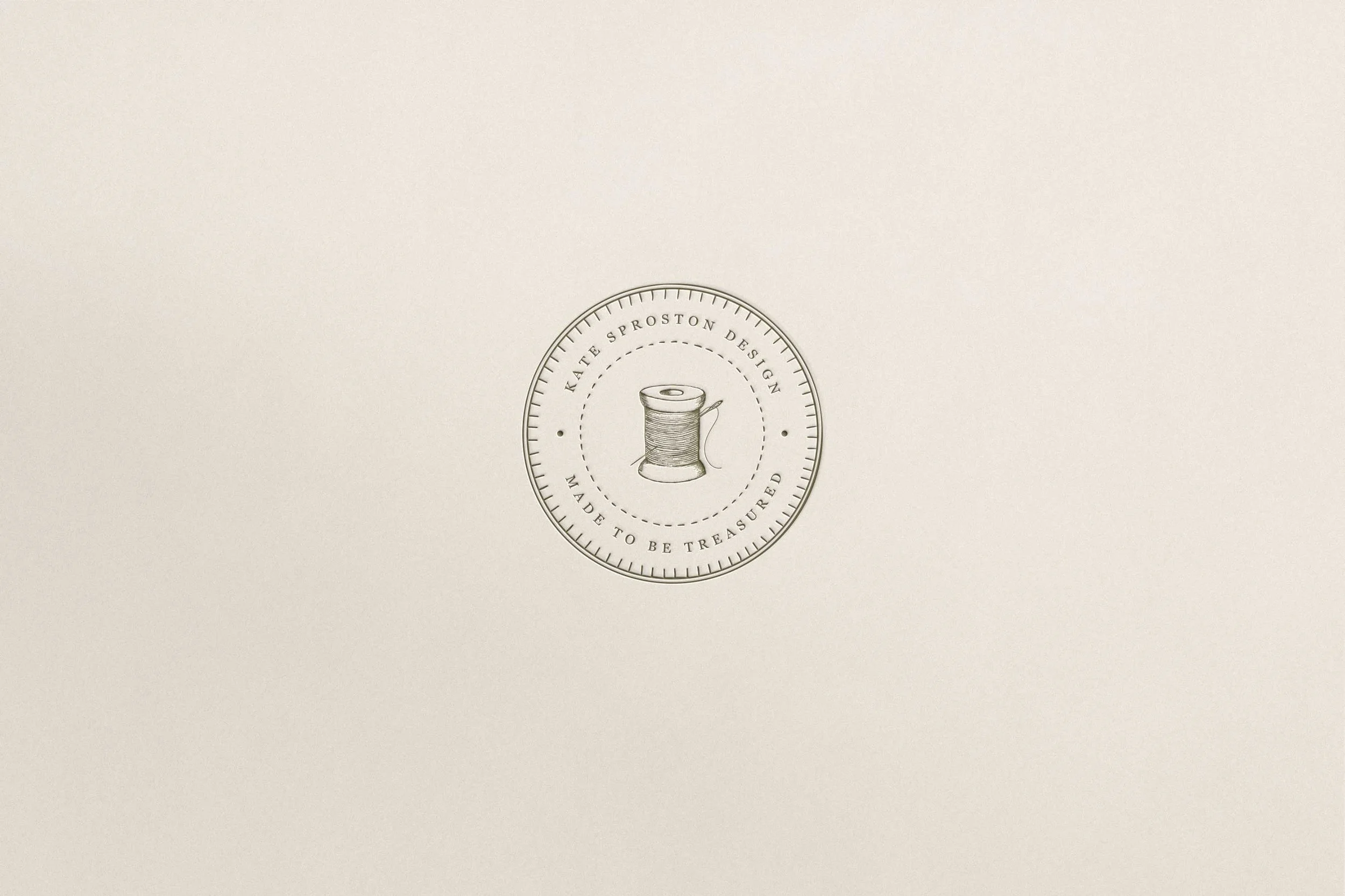
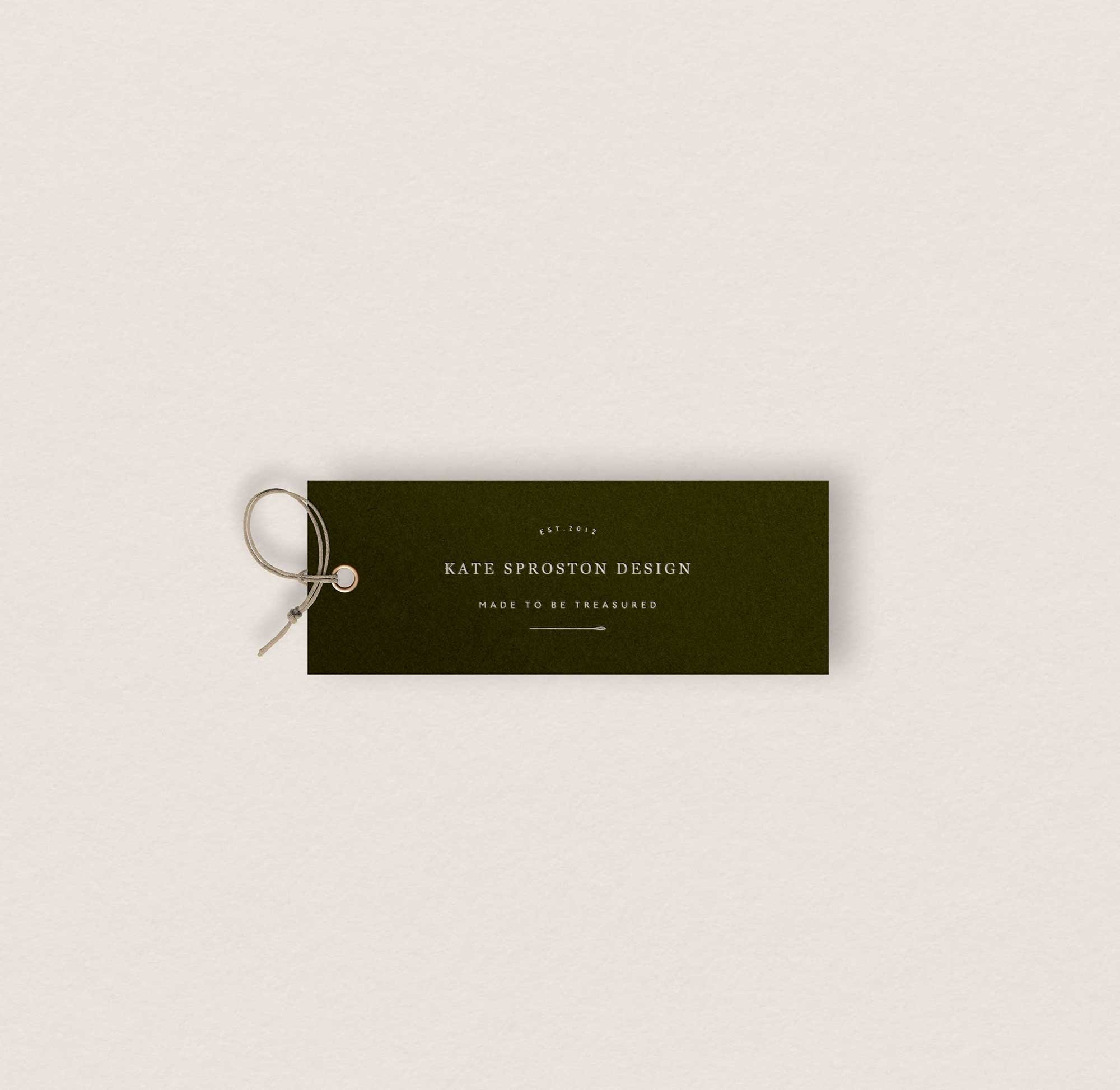
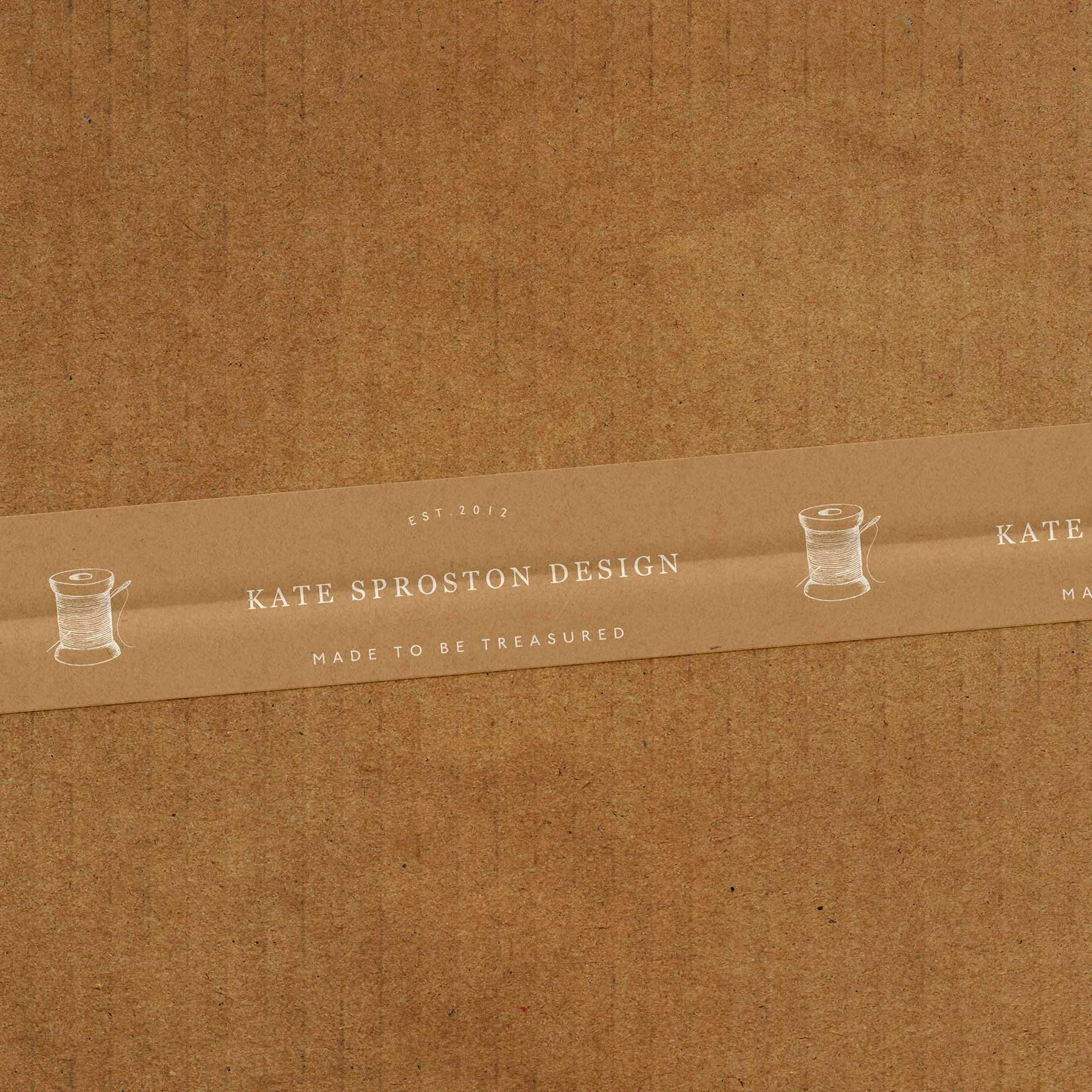
Kate Sproston Design is a British embroidery studio creating intricately crafted textile pieces inspired by the natural world. Known for detailed animal and botanical motifs, Kate produces beautifully made objects designed to be cherished as thoughtful gifts and modern heirlooms.
The aim of the project was to create a brand identity that felt refined, timeless and quietly confident - bringing the visual expression of the brand into alignment with the craftsmanship and quality of the work.
Services used: Custom Brand Design
The transformation
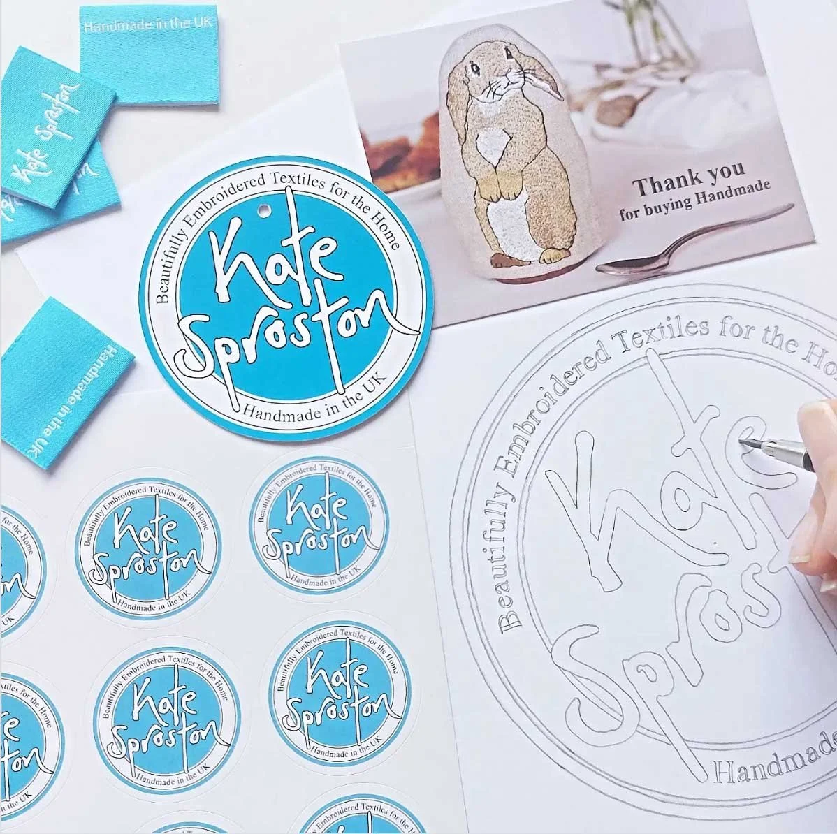
Hover over for ‘before’
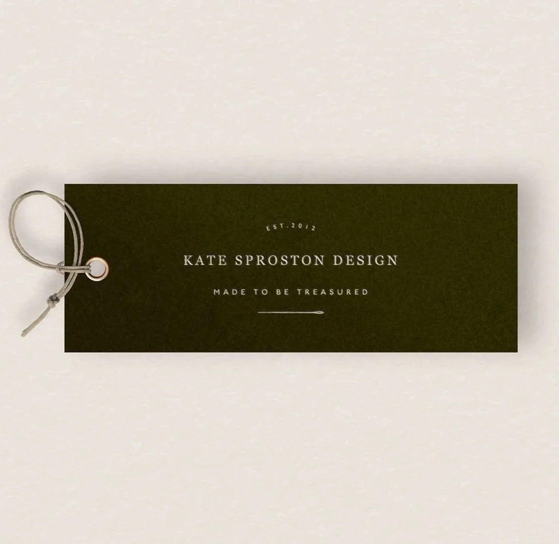
The outcome
"One of the most worthwhile investments I have ever made in my business, 100% worth every penny."
Kate now has a brand that speaks directly to the audience she was trying to reach, and the confidence to match. As she put it: it put a spring back in her step.
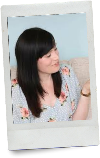
In her words
“Working with Tamsin gave me a brand that speaks directly to the audience I was trying to reach”
“I debated for a long time over whether to pay for a rebrand, but Tamsin was a dream to work with. She never made me feel like an idea or worry was silly, and the packaging mock-ups gave me a real sense of nostalgia, exactly what I want to instil in my brand. It has put a spring back in my step and I feel genuinely excited about my business again.”
- Kate, Kate Sproston Design
Could this be you?
If your craft deserves better than the brand you've been working with, here's what's possible.
I'd love to talk about what we could build together.