
How to Choose Your Brand Colour Palette (Even If You’re Not a Designer)


Choosing brand colours should feel exciting - but for many early-stage founders, it feels more like pressure than fun.
You want your brand to look polished, professional and “put together,” but suddenly you’re 27 Pinterest boards deep, second-guessing every shade of blush, rose and dusty pink - argh!
Sound familiar?
Take a deep breath - I’m here to tell you that you don’t need a design degree, a massive budget or “perfect taste” to choose a cohesive, strategic colour palette that attracts your dream clients.
As a designer who’s built brands and colour systems for women-led businesses for over 15 years, I’ve seen first-hand how the right palette can make a difference not just visually, but in your confidence, clarity and bookings.
I’m going to simplify choosing a colour palette and my hope is that by the end of this guide, you’ll know:
what colours actually belong in your brand palette
how to choose colours that support your goals
how to avoid the most common branding mistakes
and how to make your brand feel instantly more high-end and consistent
Ok, let’s get you out of colour confusion!

Step 1 - Start With Your Brand Foundations
Before choosing colours, you need clarity on:
Who you serve
What you want to be known for
What feelings you want your brand to evoke
Your values, mission and personality
Because brand colours shouldn’t be chosen randomly but as part of your overall brand strategy.
Ask yourself:
Is your brand soft and nurturing?
Bold and empowering?
Minimal and refined?
Playful and creative?
Your colour palette should support that personality.
Step 2 - Understand Colour Psychology (The Easy Version)
Colour isn’t just a visual thing, it’s also hugely tied to our emotions. Your audience will feel something before they consciously think something.
A few quick examples:
Navy - trust, heritage, professionalism
Dusty rose - elegance, femininity, romance
Emerald green - nature, calm, grounded luxury
Black - sophistication, exclusivity, high-end
Mustard - creativity, optimism, warmth
Taupe/cream - softness, minimalism, approachability
I will caveat this with the fact that colour psychology isn’t rigid or universal - different shades can communicate completely different feelings.
For example:
Pink can be nurturing and gentle… or bold, empowering and modern.
Navy can feel traditional - or contemporary and edgy when paired creatively.
So use colour psychology as a helpful starting point, not a rulebook.
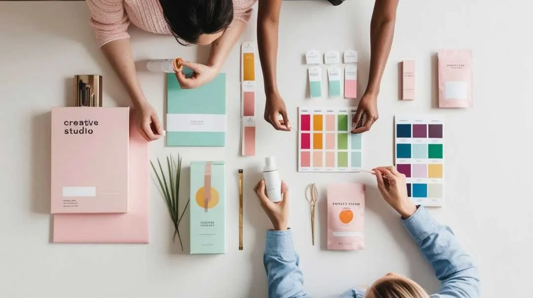
Step 3 - Build Your Brand Colour Palette
Here’s the structure I use for every professionally designed brand - including my own clients:
Choose 1-2 Core Brand Colours
These are your visual anchors - the shades people will most associate with your brand.
Tips:
Choose colours that feel timeless, not trendy
Ensure they align with the emotions you want to evoke
Think about long-term use (website, packaging, social, email etc.)
Add 1-2 Supporting ‘Base’ Neutrals
These should complement your main colours and be suitable for things like backgrounds. They also prevent your brand from feeling chaotic, and help your hero colours shine.
Examples:
Cream, soft white, stone, greige, charcoal, deep brown
Or light versions of your core colours
Add Two Accent Colours
Accent 1 - Dark functional accent
Usually used for body text, menu navigation and legibility across your touchpoints. It also provides a great contrast.
Accent 2 - High-impact emotional accent
Use this sparingly to draw attention, as a highlight and to inject some personality. You can think of it as your brand’s ‘exclamation point’!
Your final palette should include:
1-2 core colours
2-3 neutrals
1 functional accent
1 emotional accent
This is my tried-and-tested formula and it works beautifully across websites, social media, packaging, stationery and beyond.

Step 4 - Check Your Palette for Practicality
Of course, we want your brand colours to be beautiful and aesthetically pleasing, but they should also perform.
Ask yourself:
Can people read text using these colours? (Try the WebAim accessibility contrast checker)
Do they work on both light and dark backgrounds?
Will they translate to print and digital?
Do they support - not distract from - your message?
Will you still love them in 3 years?
Step 5 - If Choosing Colours Feels Overwhelming…
You’re not alone - most founders struggle with this stage!
You might like to explore my Brand Kits - they’re curated, strategic, ready-to-use brand identities built for ambitious early-stage businesses like yours.
Each one includes:
A professionally curated colour palette
Typography pairings
Full logo suite
Visual direction and usage guide
So instead of guessing… you can launch confidently and beautifully.

My Final Thoughts - Your Colours Should Feel Like Home
Choosing your brand colour palette isn’t simply about picking something “pretty.” It’s about creating clarity, recognition and giving you and your brand confidence.
Your colours should:
reflect who you are now
attract who you want to work with next
support the future of your business
When your visuals feel aligned, everything else becomes easier - your marketing, pricing, messaging and confidence.
If you want a brand palette created with intention - not overwhelm - explore my Brand Kits and find the one that feels like home:


