Branding and logo design for a luxury bridal boutique

THE CLIENT

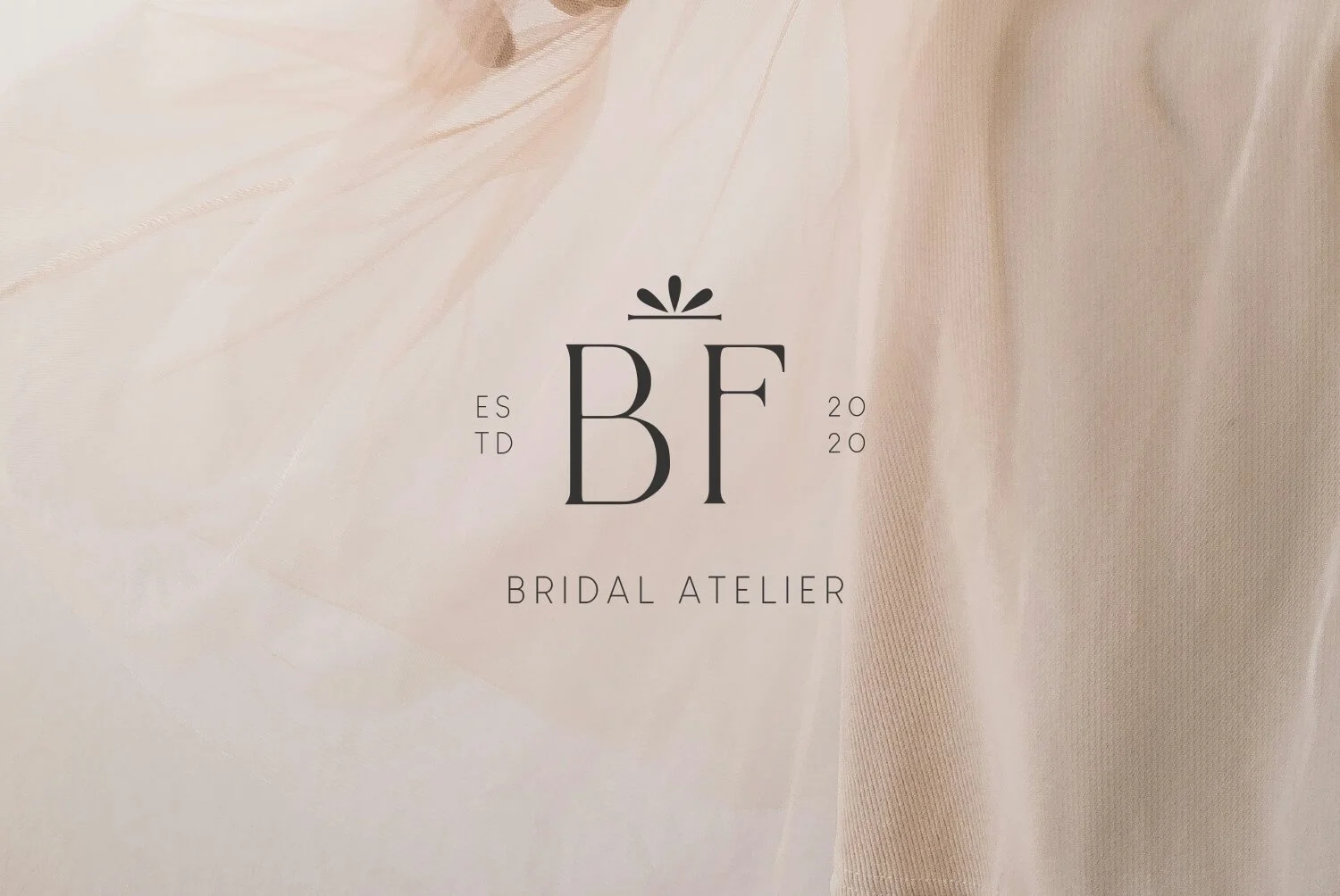
Bianca Fiore means ‘White Flower’ in Italian, a perfect motif for a luxurious Bridal Atelier. Using an elegant, customised typeface and a slightly abstract floral icon as a nod to the name, I created a brand identity and logo suite that reflected the elegance and sophistication of the boutique with a hint of flirtation that speaks to the romance and personality of the brand.

THE PROJECT

  • I used a soft, neutral palette with a hint of sage green, taupe and an accent colour of charcoal for a look that was bridal but not too conventional. I created a full branding suite to include logo variations, submarks and pattern for the brand to use over all their customer-facing touchpoints.


Bridal atelier logo with the name 'Bianca Fiore' in elegant gold lettering on a cream background.
Logo for Bridal Atelier with initials BF, established 2020, on a soft pink fabric background.
Embossed logo reading 'Bridal Atelier' on a gray background.
Black and white photo of a bride wearing a tulle wedding dress, lying on her back with her legs raised and crossed at the ankles, against a plain wall. The text 'Bianca Fiore Bridal Atelier' is on the lower right side.
A gray tag with silver lettering that reads "BF 2020" and "Bridal Atelier" hangs against a light gray wall.
Embossed logo on a gray surface reading 'Bianca Bridal Atelier Foire' with a small decorative element inside the letter 'O'.
The image shows a soft, light-colored background with shadowed leaves. Centered in the image is the text "Bianca Fiore" in elegant, black script. Above this, small text reads "ESTD 2020" with a decorative symbol between "ESTD" and "2020." Below, the words "Bridal Atelier" are written in a simple, uppercase font.
Embossed logo with the initials "BT" and a small decorative element above.
Gray surface with small flower-shaped cutouts, some all white and others with a brownish hue showing through.

Let’s work on your brand identity, together.

MAKE A BOOKING ENQUIRY